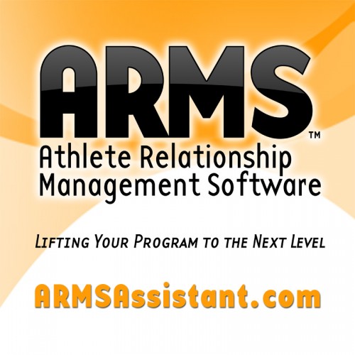
One of my clients (ARMS – Athlete Relationship Management Software) needed a billboard design to be displayed in a university stadium. Here are some of the revisions we made, going from the first draft to final version. The requirements were to build two square billboards, one 24″x24″ and the other 8’x8′.
First version:
In the first draft, I simply pulled elements from the existing ARMS website and adapted them for use in a square billboard. This involved scaling up the background gradients and building the rest of the artwork from the original elements — logo files and fonts to ensure maximum crispness when printed.
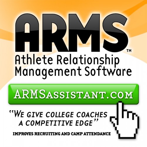
Second version:
In the next revision we decided to emphasize the software messaging by putting the URL into an easily recognizable button element. We also substituted some different language in place of the website’s tagline.
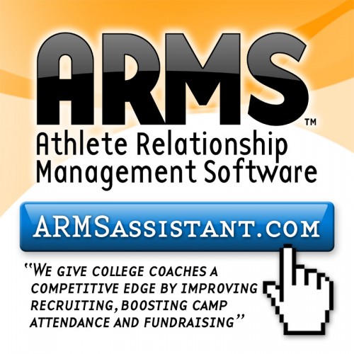
Third version:
Changed the button color to blue to stand out more against the orange background and adjusted the wording to be more concise and less crowded.
Fourth (final) version:
In the final version, I made a number of final tweaks to the design, including emphasizing the logo highlight more so it will show up better when viewed at a distance. I also whittled the marketing message down to 3 simple bullet points, more easily read by the intended audience — coaches and athletic directors. A final increase in the height of the button helps the URL to stand out a bit more, and some bottom gradient arcs help complete the design and add additional movement and interest.
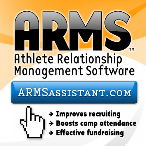
The final full-size Photoshop PDF for the 8’x8′ 150dpi file is 46.6 MB, compressed into a ZIP file only 6.9MB.
